Meesho Redesign
Meesho
Redesigning Meesho's Desktop Shopping Experience
Enhancing product discovery, strengthening visual consistency, and creating a more intuitive shopping journey for budget-conscious customers.
View Prototype
Year
2023
Duration
4 Weeks
Type
Academic Case Study
Team
Individual Project





Homepage Hero
Usability Principle
Flexibility & Efficiency of Use
Findings
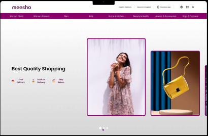
Multiple promotional banners competed for attention, creating visual clutter.
The hero section lacked interaction and failed to effectively highlight featured promotions.
Solution
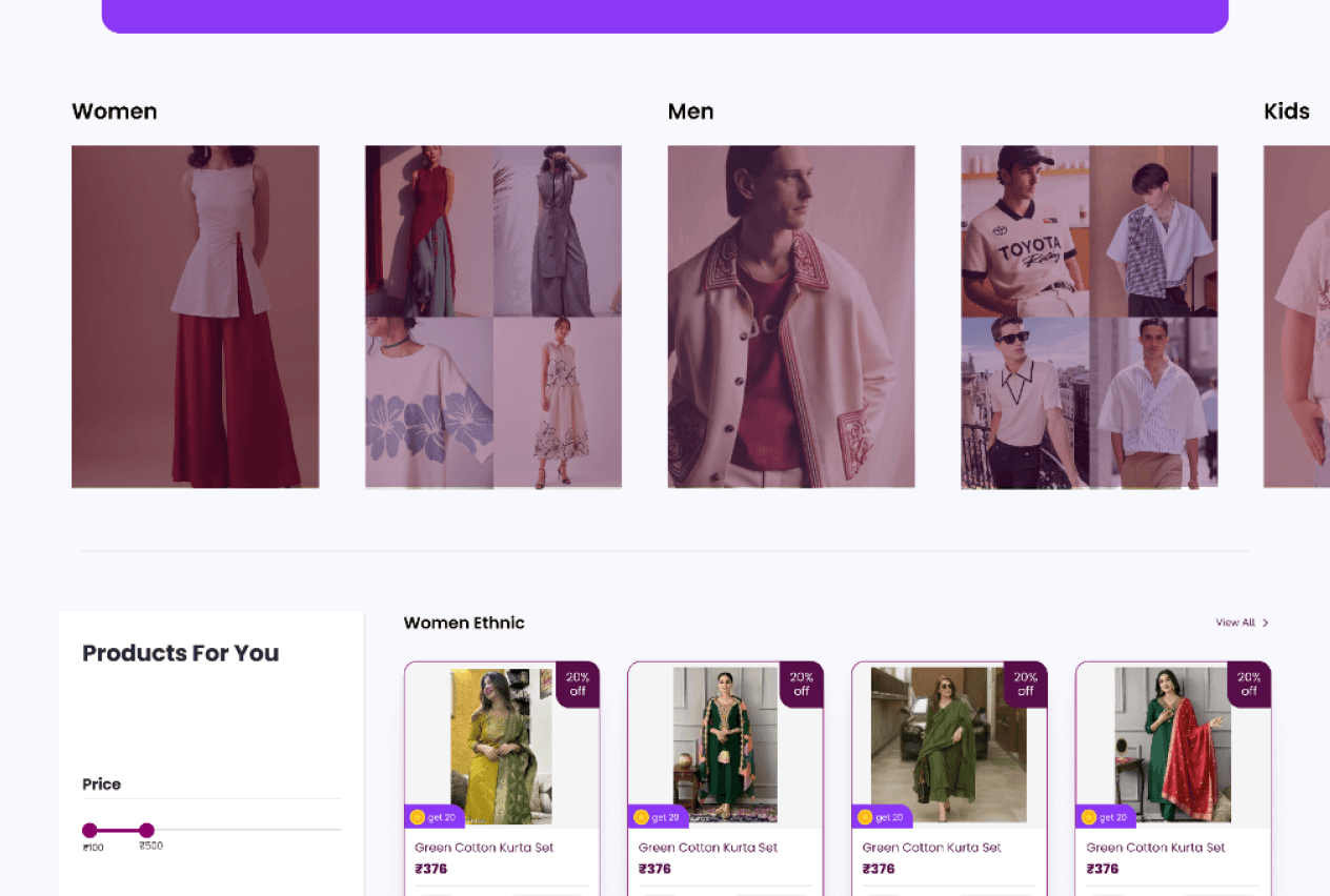
The homepage was redesigned with a single interactive hero banner featuring dynamic card transitions. The varying card sizes establish a clear visual hierarchy, while interactive animations create a more engaging browsing experience and draw attention to featured content.
Doherty Threshold
Law of Prägnanz
Fitts's Law
Before

AFTER
Navigation
Usability Principle
Consistency & Standards
Findings
Navigation icons and labels followed inconsistent layouts.
Primary categories lacked visual cues, making navigation less intuitive.
Solution
The navigation was redesigned with a consistent icon-and-label layout across all menu items. Category icons were introduced to improve recognition, create visual consistency, and help users navigate more efficiently.
Law of Similarity
Affordance
Fitts's Law
Before

AFTER

Bento Grid
Usability Principle
Aesthetic & Minimalist Design
Findings
Promotional banners were repetitive and lacked a clear visual hierarchy, making featured content easy to overlook.
Solution
Redesigned promotional sections into a Bento Grid layout, creating a more engaging homepage while clearly highlighting top categories and deals.
Law of Prägnanz
Hick's Law
Before

AFTER

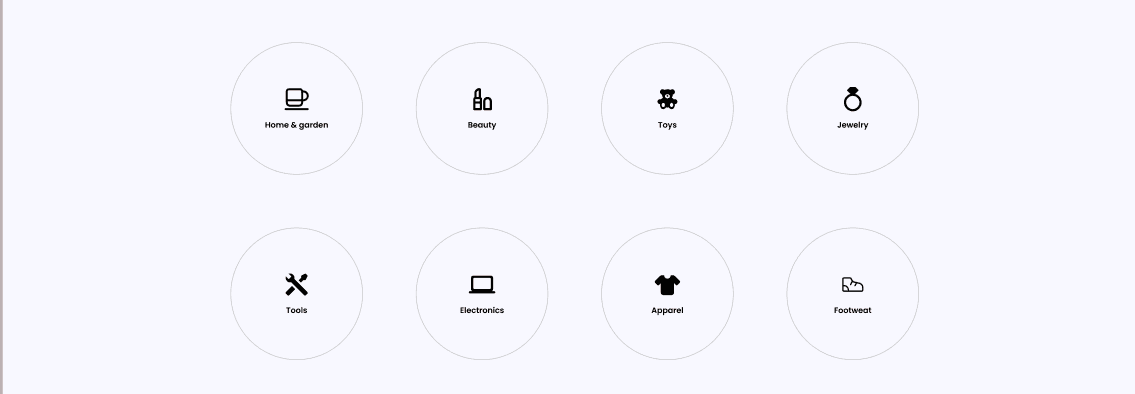
Category Icons
Usability Principle
Recognition Rather Than Recall
Findings
Categories were buried in the navigation, making them difficult to scan and increasing visual clutter.
Solution
Introduced circular category icons with labels on the homepage, allowing users to quickly identify and access popular categories with a single click.
Affordance
Fitts's Law
Before

AFTER
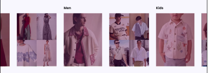
Auto-Scrolling Apparel
Usability Principle
Flexibility & Efficiency of Use
Findings
The apparel section required excessive scrolling and did not effectively showcase trending products.
Solution
Added an auto-scrolling carousel for the apparel section, making product discovery more engaging while allowing users to browse featured collections effortlessly.
Doherty Threshold
Fitts's Law
Before

AFTER
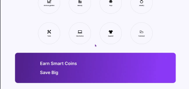
Earn Smart Coins Banner
Usability Principle
Visual Hierarchy & User Engagement
Findings
The loyalty program lacked prominence and failed to communicate its benefits effectively.
Users could easily overlook reward opportunities while shopping.
Solution
A dedicated "Earn Smart Coins & Save More" promotional banner was introduced to clearly highlight the loyalty program. The banner uses strong visual hierarchy, concise messaging, and a clear CTA to encourage users to engage with the rewards program while browsing.
Von Restorff Effect
Law of Prägnanz
Fitts's Law
Before

AFTER
Product Listing
Usability Principle
Recognition Rather Than Recall • Consistency & Standards
Findings
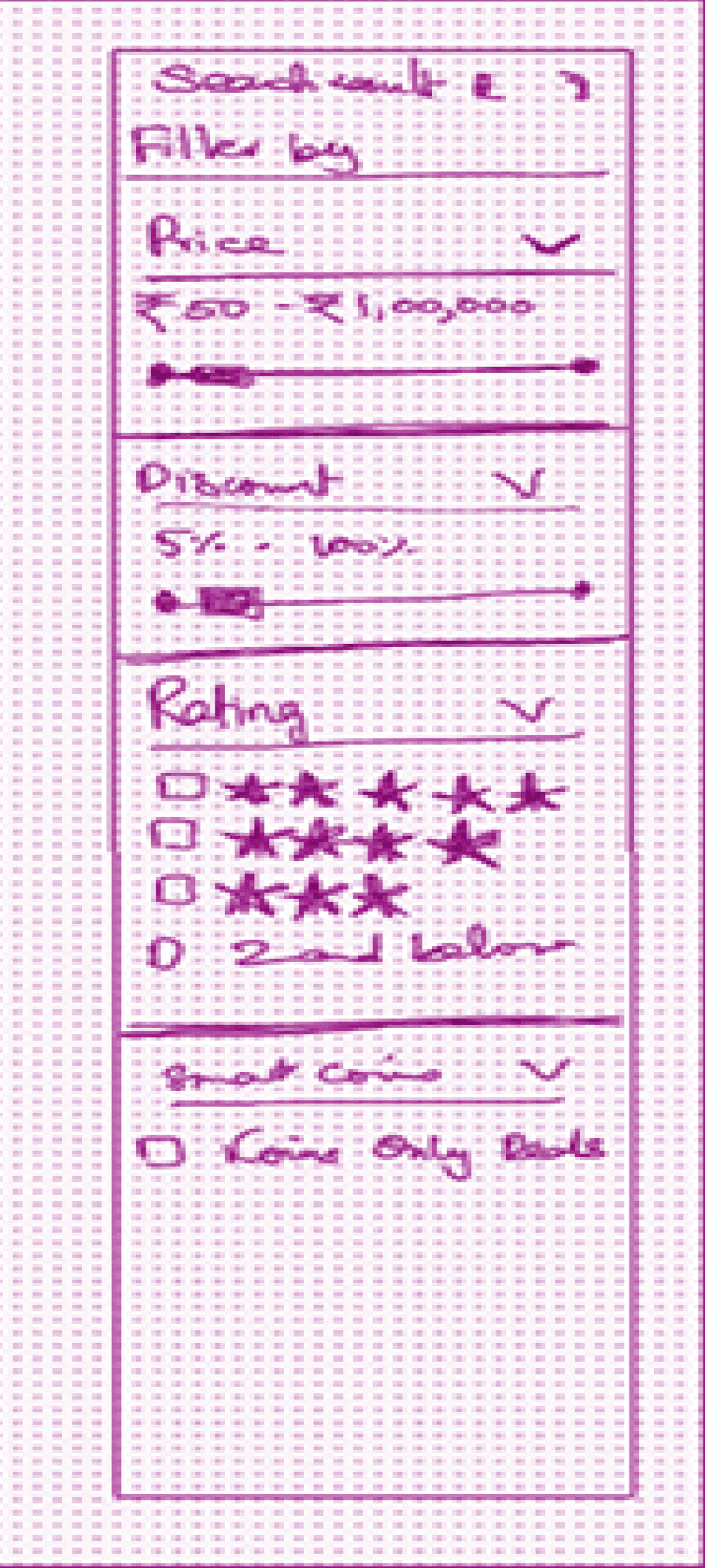
Too many filter options increased cognitive load.
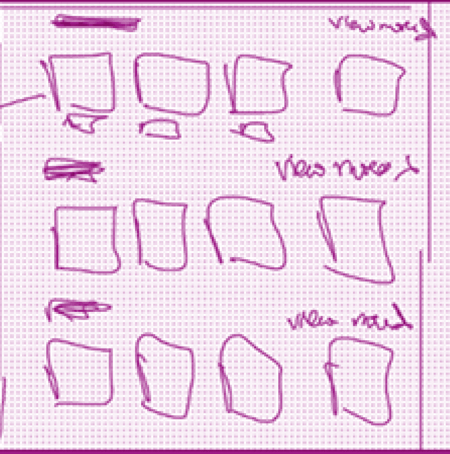
Product cards lacked consistency and visual hierarchy.
Important information such as discounts, ratings, and delivery details was difficult to scan.
Solution
The product listing page was redesigned by simplifying filters to the four most important options—Price, Discount, Rating, and Smart Coins—making product discovery faster and reducing decision fatigue. Product cards were also standardized with consistent sizing, improved spacing, grouped information, and recognizable icons to enhance readability and comparison.
UX Laws Applied
Hick's Law
Miller's Law
Law of Similarity
Law of Proximity
Uniform Connectedness
Before

AFTER

Filters
Usability Principle
Recognition Rather Than Recall • Error Prevention
Findings
The filter panel contained too many options, increasing cognitive load and making it difficult for users to quickly find relevant products.
Solution
The filters were simplified to the four most essential options: Price, Discount, Rating, and Smart Coins; allowing users to narrow their search faster while reducing decision fatigue.
Hick's Law
Miller's Law
Before

AFTER

Footer Redesign
Usability Principle
Aesthetic & Minimalist Design
Findings
Contact information lacked visual distinction.
Social media icons competed with important footer content.
Legal information created unnecessary clutter and increased cognitive load.
Solution
The footer was reorganized by introducing icons for contact details, moving social media links to a secondary section alongside the copyright information, and relocating lengthy legal content to a dedicated Legal page. Increased whitespace and clearer grouping improved readability and reduced visual clutter.
Law of Proximity
Law of Similarity
Law of Prägnanz
Hick's Law
Before

AFTER